Data Visualization in Machine Learning — Beyond the Basics
This is not a tutorial. These are my notes from various Machine Learning articles and tutorials. My personal cheatsheet
for interviews and reviews. Any feedback and corrections are welcome.
If you’d like to read more, please let me know as well. These notes are
more applicable for python users. Does not include ggplot, great for R.
Prerequisites and Dependencies
This
tutorial and overview is python based so we use matplotlib.pyplot.
These commands can be run in command line and in Python Notebook with
just a bit of modifications. Any reference to plt means the function is from the matplotlib library.
import matplotlib.pyplot as plt
# will get object does not have bar, scatter.... function_name error # if not imported
Plot a Bar Chart
Bar chart, bin chart: useful for frequency analysis, distributions and counts.
labels = ['A','B','C','D','E','F','G']
nums = [13,24,5,8,7,10,11]
xs = range(len(nums)) #[0, 1, 2, 3, 4, 5, 6]
#xs is a convention variable name for x axis
plt.bar(xs,nums)
plt.ylabel("Customize y label")
plt.title("Customize graph label")
plt.show() #display the plot
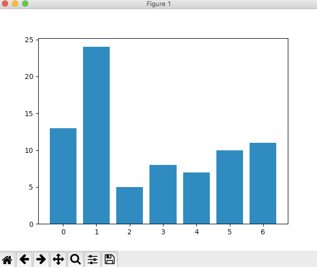
Don’t be deceived by its simple look. Frequency analysis is very powerful in data EDA, stats and machine learning.
Plot a Histogram
Histogram will automatically divide data into bins.
import matplotlib.pyplot as plt
import pandas as pd
nums = [99, 1, 3, 5, 7,33, 23,684, 13, 3 ,0, 4]
pd.Series(nums).hist(bins=30)
# <matplotlib.axes._subplots.AxesSubplot object at 0x10d340d90>
# returns object in memory
plt.show()
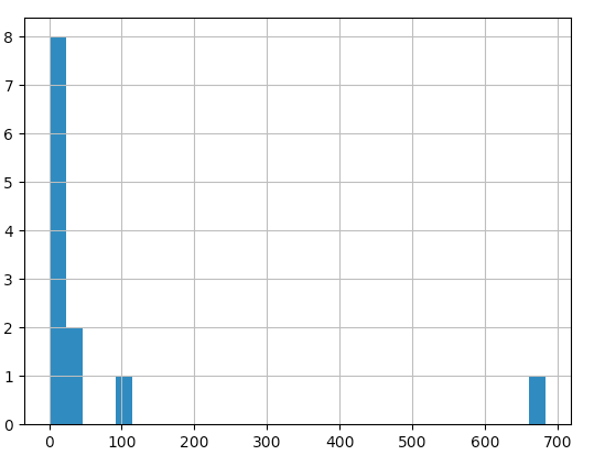
Also useful for visualizing distribution and outliers.
Scatter Plot
How is scatter plot beyond the basics?
Scatter plot is extremely intuitive yet powerful. Just plot the
vertical coordinate and horizontal coordinate of each data point in the
sample to get its scatter plot. If the relationship is non-linear, or
there may be the presence of an outlier, these targets will be clearly
visible in the scatter plot. In the case of many features i.e.
dimensions, a scatterplot matrix can be used.
Below is a screenshot of pandas scatterplot matrix in the official documentation.
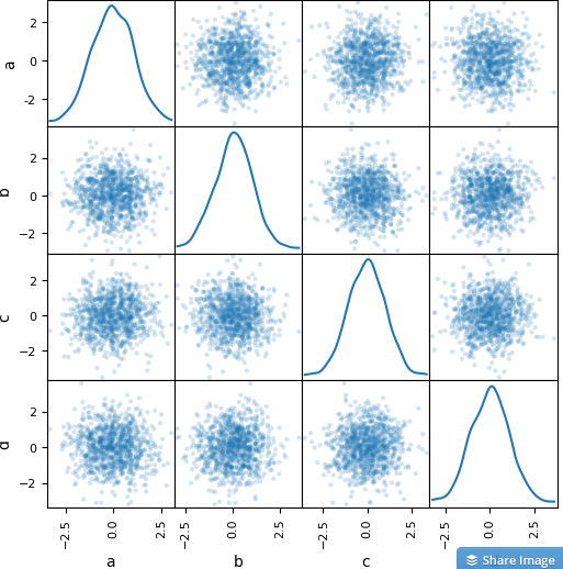
Clearly
the relationship is not linear. The diagonal is the variable vs itself,
so it’s showing a distribution graph instead of scatter plot. Neat,
looks like the variable is normally distributed.
Scatterplot is a great first visual. Too many features? Try sampling or generating data subsets before visualizing.
Use
pandas.DataFrame.describe() to summarize and describe datasets that are
simply too big. This function will generate summary stats.
Scatterplots are useful for pairwise comparison of features.
Scatterplots
can go beyond two dimensions. We can use marker size and color to
illustrate the 3rd dimension, even 4th dimension as in the famous TED
talk of economical inequality. The presenter even used timeline (animation) as the 5th dimension.
Visualizing Error
Youtube
deep learning star Sraj shows a 3D visual of error function while
altering y intercept aka bias and slope for linear regression. The
global optima i.e. the global minimum in this case is the goal of gradient descent algorithm.
Error
functions have shapes and can be visualized. Local optima which
prevents your model from improving can potentially be visualized.
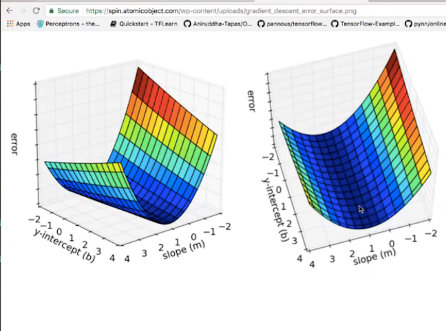
Gradient
can be visualize as directional arrows that travel in the direction of
the global minima along the shape of the 3D plot. It can also be
visualized as a field of arrows in a matrix.
Each
residual (y_i — y_hat) can be visualize as a vertical line connecting
the data point with the fitted line in linear regression.
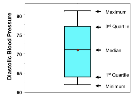
Data Scientists Love Box Plots
Why? It displays essential stats about distribution in a concise visual form. Aka candle stick plot. Also popular in finance.
Max, 3rd Quartile, Median, 1st Quartile, min.
This
is known as the box and whisker graph too. It’s popular among
statisticians. Used to visualize range. It can be drawn horizontally.
What’s
between Q3 and Q1? The interquartile range, which used in analyzing
outliers. Q1–1.5*IQR is too low, Q3+1.5*IQR is too high.
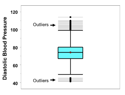
Box whisker plot displays outliers as a dot!
Check out Boston University’s Blood Pressure dataset box whisker plot with outliers.
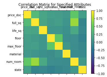
Heatmap
Did
you say heat map? Heat map has been in and out of favor. Web analytics
still use heat map to track events and clicks on a webpage to identify
key screen real estates. Why should we use heat map for machine
learning?
It
turns out that generating a heat map of all the feature variables —
feature variables as row headers and column headers, and the variable vs
itself on the diagonal— is extremely powerful way to visualize
relationships between variables in high dimensional space.
For
example, a correlation matrix with heat map coloring. A covariance
matrix with heat map coloring. Even a massive confusion matrix with
coloring.
Think
less about the traditional use of heat map, but more like color is
another dimension that can visually summarize the underlining data.
Correlation Matrix Heat Maps are frequently seen on Kaggle, for exploratory data analysis (EDA).

More Data Visualization Magic
Did
you know that you can visualize decision trees using graphviz. It may
output a very large PNG file. Remember the split of decision tree is not
always stable — consistent over time. Take it with a grain of salt. The
benefit of visualizing a decision tree is to understand where and how
machines made decision splits. Decision tree boundaries can be
visualized too, see screenshot below from Sklearn documentation.
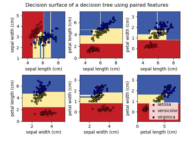
Visualizing
models, decision boundaries and prediction results may give hints
whether the model is indeed a good fit or it is a poor fit for the data.
For example, it is high bias to ignore the nature of our data if use a
straight line to fit a circular scatter of dots.
Researchers even visualized different optimizers to see their descend to minimize loss.
Did
you know you can create interactive plots using Plotly right in Jupyter
Notebook? Interactive plots allow you to visualize complex data, toggle
and change parameters. For example you can slide to change values of
your hyperparameters and visualize how the model performance change in
gridsearch and other systematic search of the space.

kellybags onlineshop
ReplyDeleteIf you want to buy gucci bags with good quality and low price, you can choose to buy them here kelly bag
QuickBooks Online is most loved of all bookkeeper and experts Technical team support number 1844-857-4846. Choosing a right accountant to do your payroll and other accounting work is extremely important for any business. The Intuit work locale Enterprise variety must be familiar on structure with advantage however much as could be expected from its focal points.
DeleteQuickBooks Payroll Support Helpline Number USA
QB Help Intuit Support Phone Number
Contact QuickBooks 24*7 Support Phone Number
QuickBooks Online is most loved of all bookkeeper and experts Technical team support number 1844-857-4846. Choosing a right accountant to do your payroll and other accounting work is extremely important for any business. The Intuit work locale Enterprise variety must be familiar on structure with advantage however much as could be expected from its focal points.
ReplyDeleteQuickBooks Payroll Support Helpline Number USA
QB Help Intuit Support Phone Number
Contact QuickBooks 24*7 Support Phone Number
Quickbooks 24/7 desktop payroll service provid. +I-844-857-4846 you get the best customer service & Quickbooks Support, We are amongst the top quickbooks help & support providers. If you're having account issues, try recovering your Intuit account information by visiting the Intuit account recovery page. QuickBooks is a well-known accounting programming that permits you to achieve your day by day accounting assignments effectively. Our Quickbooks Desktop Support Team provides 24*7 Quickbooks Online Support by calling our toll-free number.
ReplyDeleteClick Here More Information
QuickBooks Technical Support Phone Number
QuickBooks Tech Upgrade Support Number
QuickBooks 24/7 Desktop Support Number
QuickBooks Update Support Phone Number
Thanks for sharing this content.
ReplyDeleteLeanpitch provides online training in Scrum during this lockdown period everyone can use it wisely.
Scrum Values